When you combine this past years unprecedented experiences with 15+ years as CEO, customer and partner interactions, countless technical training and certifications, and reading any technical trend article and email I can get my hands on, you might have a pretty solid understanding of which technologies and strategies to make a priority for your optimal business success.
Enjoy my 2021 outlook below!
Retail and E-Commerce
2020 showed us that our communities chose to support local businesses, buying local as an alternative to the convenience and sometimes lower pricing of large online marketplaces or offshore services. This was despite many folks having to tighten their own belts due to the economic downturn. Although the community support is priceless, it’s forced a lot of uncomfortable change for traditional brick and mortar businesses to offer goods and services online.
In 2021 it’s going to be critically important to engage and nurture these audiences and to maintain loyalty. Some business owners who have not embraced a digital strategy may find this process intimidating and uncomfortable. If so it’s important to recognize when it makes sense to get help, in order to retain the local support. Those who embrace and lean into these changes will fare better in 2021.
Artificial Intelligence
No longer restricted to the lore of science fiction, AI is integral to business success. While AI has become more mainstream, it is not yet ubiquitous and it’s still out of reach for many. In the 50s and 60s it was thought that technology was supposed to give us more free time to enjoy life. Instead it has allowed us to get more done in the same amount of time, inflicted attention deficit as we are inundated with information, and I’m not convinced we’re better for it.
Unfortunately the genie is out of the bottle and those businesses which adopt AI technologies earlier are going to see a better long term outcome. It’s not a question of “if” your competition will use AI, it’s only a question of when. AI technologies will become a bigger part of business websites, and this will not be limited to large businesses. Make a point to learn about how AI can benefit your business in your specific industry.
Personalization
While many find it patronizing and bordering on “creepy” (myself included), with so little time to spend on each individual objective, we find ourselves choosing the shortest path to complete each task. This is represented in our purchasing behaviors across the board, whether that’s ordering online instead of in-store, or choosing where we get in-person services based on how quickly and efficiently we can get in and out, even if it comes at a premium.
Part of engaging and maintaining your relationships with your customers requires you to personalize those experiences. The better job you can do to match your customers interests with your product or service offerings, the shorter the path and thus least resistance to a sale. Remember Staples and the Easy Button? Embrace being the easy button earlier than later.
Marketing Analytics
Does your website have Google Analytics? Do you ever look at it? Even if you haven’t looked recently, you should absolutely add this FREE resource. It doesn’t provide all the answers, but it can’t give you historical information if it’s not turned on. In order to understand your customers, you have to gain insights as to their interests and engagement as it relates to your website and your brand.
Beyond basic website analytics, other tools allow you to see how visitors interact (or not) with the content within the pages of your website. These tools are not new, nor are they limited to your big competitors, and they do come at an expense. Your visitors have micro attention spans, and if they can’t quickly find what they want, you lose a precious opportunity. Analytics may seem intimidating and overwhelming, but those who embrace them will be able to act strategically.
Diversify and Scale
This seems like an obvious one even outside of a pandemic, but what we collectively learned is that too much focus can be a bad thing. Whether that’s a wider selection of products and services, or it’s a matter of how you monetize on those, depends on the business. Likewise businesses that don’t embrace scaling out often miss an opportunity to monetize on their investments – hence economies of scale.
The reason the software industry transitioned to subscription only licensing is that they couldn’t depend on consistent revenue from “optional” upgrades. The result is that customers always get the latest features and bug fixes, and can do more as a result of those improvements. Think about how you can bring recurring revenue into your business while adding value for your customer.
As a strategic technical business advisor, my brigade and I are happy to assist your organization with any of these initiatives as well as several other customized service offerings. Please get in touch via email or schedule a brief meeting.
2020 started like most years for us, with optimism, hopes, and dreams for what we could accomplish. Also typical, by March I know whether business is trending in a positive direction, and the timing this year was remarkable. Cloud Brigade was in the beginning stages of a business pivot which is anxiety inducing in itself, and the act of rising above the increasing digital noise online was feeling arduous. .
Initially as some projects were put on hold, other pandemic related projects took their place, but this was short lived. Like our fellow small businesses, we went into survival mode. I reached out to our “coopetition” to assess the situation, and found mixed reports of substantial decline, or a surge in business. Where you sat in this game of musical chairs depended on what your niche was, how that customer segment was funded, and just a bit of happenstance.
There’s no question that businesses are a lot like families, and being the CEO feels a lot like being a parent. Parents have to navigate uncertainty, take on new and uncomfortable challenges, and make difficult decisions all while showing determination and confidence, so as not to instill the fear you harbor into your children. At the same time you’ve got all your normal responsibilities and you don’t have the luxury of melting down, you just have to paddle faster.
The Plunge
The decision to take out PPP and EIDL loans was a bit demoralizing but necessary. At the time it wasn’t clear if or when the bottom would drop out, but it did pretty quickly. One thing I have learned in 16 years of running a business, is that change always comes with opportunity. PPP allowed us to keep everyone fed, and when work was sparse our employees worked on internal projects. These were largely technical learning opportunities to further our pivot.
As the middle of summer hit, we made the decision to do something strategic we never could afford to do previously. We invested our $150k EIDL loan into a complete marketing and sales reboot for our Cloud Brigade brand. Sure we had invested smaller (but not trivial) sums into individual areas of the business, but we were never afforded the luxury of orchestrating a comprehensive plan.
This was a risky move and enough money to get us in trouble with no guarantee of succeeding. The bottom line was I could sit here and watch the business that I have poured my life and soul into – die, or I could lean into the risks and have some chance of making it out of COVID-19 in a better place. As Neil Armstrong said, “There can be no great accomplishment without risk.”
I set out to hire a full time marketing resource, as well as a sales and business development person. As fortune would have it, both those folks were available within a few degrees of separation in our tight knit business community. One mistake I was not going to repeat was hiring a sales person without getting our marketing house in order.
By mid July the three of us formed a power team and began the ideation process. We took a forensic inventory of the company, examining our history, our pain points, and our aspirations. We also analyzed the rapidly changing nature of business, marketing, and the things we would need to embrace to fill in the gaps. Like many small businesses our past marketing was based on a number of ill-formed assumptions and isolated experiments which didn’t yield results. As a past boss used to tell me – “There is never time to do it right, but always time to do it over”, and this was no exception.
A lifetime reduced to ash
The Flip Turn
Just as we laid out our plan and began to take initial action, the CZU fire happened just a month in. I got home at 7:30pm on Tuesday, August 18th and began to receive text messages from friends asking if we needed a place to stay. Wait, what? I knew of the fire in Butano, but that was 20+ miles away. A quick search on my phone revealed that a lighting strike in Waddell Creek some 10 miles away had been burning for two full days before anyone seemed to be informed.
The fire was burning a mile away from my house and the entire town of Boulder Creek was evacuated. Two days later on my girlfriend’s birthday, our home and all of our lives’ possessions were gone. I’m not going to pretend to have overcome this incident in short order, nor had I with other past personal tragedies that pulled me away from my business. Paddle faster.
One thing I’ve learned over the many transitions in life is to focus on the positives. I think at one point I just got tired of being angry, not liking the person I had become, and to make a commitment to myself to be the best person I could be. Far from perfect I assure you, but dwelling on negatives just delays recovery. By taking time to be grateful for the good things not only provides an inner peace and a coping mechanism, it also helps others in ways you may never actually know.
The silver linings for me personally was accelerating our move out of the Santa Cruz mountains to the Santa Cruz shore, where our jobs and many of our friends are, and replacing a lot of time and fuel spent in a car with a new mode of transportation in the form of e-bikes. That commute time was replaced with more time for personal connections, and I’ve got to admit, more time for paddling (literally and figuratively).
Paddle time
Lastly it was an opportunity to let go of a lot of things that were weighing me down. I was burdened with an accumulation of stuff from my past life and the lives of my lost family members. These were things that represented the many phases of my life, whether it be a piece of furniture from when I was a kid, my Dad’s record collection (OK, that really hurt), or the literature collection of my introverted brother who most people never knew like I did.
One member of our CZU community expressed this best, educating that losing all of your belongings is a harsh exercise in finding your identity, and realizing that you are not defined by your stuff. To me, at the end of the day what our most valuable possessions are our relationships and the memories we create.
The Rapids
2020 was not without some good fortune in the form of partnerships. One in particular is a classic example of “you get what you give”, and that is our relationship with AWS, or Amazon Web Services to the non-technical readers. As some of our past consulting services have become commoditized, we’ve had to become particularly forward looking and leaning, and I believe this will only accelerate for all businesses.
In 2019 we began our journey into Machine Learning which is the foundation of modern Artificial Intelligence. As with any new business technology it is both a challenge and an opportunity to be an early adopter. Until you find those business opportunities, you need to explore the potential which sometimes manifests in unusual ways. For us it was in the form of The Poopinator, something that seems to have taken on a life of its own.
This is a great reminder we can’t always take ourselves seriously, everyone around us is human, and sometimes you just have to throw caution to the wind and do something that doesn’t seem to fall within the confines of traditional business practices. We took a bold step and shared our experimental project within some of our circles, and it caught the attention of the AI product marketing team at AWS.
AWS Community Builders
This project led to a couple of developments we hope helps our boutique technical consultancy rise above that digital noise. First I was recruited into a beta group at AWS called Community Builders. This is a group of like minded technologists who enjoy playing with cutting (and sometimes “bleeding”) edge technology. We also like to share our knowledge and experience with others, and support each other through technical hurdles.
Next we were connected with a production studio working on a new series called AWS Innovators. This is a collection of short videos chronicling the unique and quirky ways people are using new technology. In our case this was catching dogs pooping on your lawn, but this silly use case led to something more tangible such as automated PPE detection.
Promotion aside, our pandemic journey also encompassed our corporate community purpose in the form of learning opportunities through internships. While embracing other potential use cases of this technology, we were able to execute projects related to the exploration of COVID-19 data as it correlates to social issues, as well as finding better ways to dynamically manage automobile traffic on congested city streets.
The Stride
It’s too early to tell what 2021 will hold for Cloud Brigade and its family, and as 2020 is quickly coming to a close I can tell you it was all worth it. I feel like our team has collectively accomplished a lot of heaving lifting, learning, and personal growth, and that will only benefit how we approach the coming new year.
What can businesses expect in 2021? While I’m not clairvoyant, through our own challenges and personal journey I have been given a gift of insight into changes in the business landscape. The big takeaway is that to survive and thrive, you need to Lean-In to the unlimited possibilities in 2021. Read more about what I predict, here.
The Problem
COVID-19 is spreading and killing people unevenly through our national population, and public policy makers need a better way to narrow their focus to best handle this pandemic.
The Data Science Problem
Can we create and use a set of Machine Learning models and Data Science tools to identify the leading indicators of a COVID-19 danger zone or hot-spot and help our community protect itself against this deadly disease?
The Resolution
Using Linear Regression models, correlation matrices, and Kmeans clustering algorithms we can put large amounts of data into a quick process that can identify the largest indicators of danger zones.
The Benefits
Our dashboard can identify areas where COVID-19 is hitting hardest and highlight reasons why that might be to help policy makers respond to this pandemic and prevent the proliferation of subsequent health crises.
The Use Case
Policy makers can use this dashboard to create preventative policies such as masking requirements, social distancing requirements, closures of bars/indoor dining, or the limiting of public gatherings; can identify industries such as farming or meat-packing that have higher incidence of transmission and more dangerous comorbidities in the population.
Our Future Steps
Using DeepAR in a Recurrent Neural Network, we can create a time series prediction engine that can help us plan and react on the fly to changes in the spread of the virus.
Origin Story
About a month after the stay-at-home orders were issued in the Bay Area, we began to notice a disparity in what was being reported in the news about COVID-19. Every day we were seeing dashboards with data graphs around infection rates and death rates, but we also heard stories reported that weren’t being reflected in that data.
We’re talking about everything from socio-economic and behavioral data, to unproven claims about climate and sunlight killing the virus. We thought that if we could acquire this data, we could learn some interesting things about COVID-19 using Machine Learning. By identifying the leading indicators present in the hot spots, we might better understand what was contributing to these outbreaks, and debunk some myths along the way.
The first thing that we had to do was to identify what information to collect and from what sources to get our data. We talked about some of the obvious, such as how many daily cases and deaths were happening, and found that Johns Hopkins University had an open-source data repository.
We reviewed a list of potential types of data we might consider, and it was important that the data be similar in granularity, preferably down to the county level. The list included :
Climate data (temp, humidity, precipitation, and cloud cover)
Population density by race
Wealth distribution
Urban/rural distribution
Travel volumes
Deaths by cause
Political leanings
Religion leaning
Education levels
Responsible Reporting
It’s important to acknowledge the data in this list contains a potpourri of hot button topics, we knew that going in. The purpose of this project was not to support (or oppose) any particular point of view, in fact it was quite the contrary – to explore and uncover the hidden truths within the data.
Of equal importance, one must embrace that correlation does not imply causation. For those of you who aren’t statisticians, this means that although we will find relationships in the data, those alone to not provide the underlying cause. They will however warrant further exploration and discussion.
Our list was large, but we needed to start small and to validate our findings at each phase, so we chose a subset of the original data to start.
We looked for different sources of weather data, population data, per-capita and household incomes, total jobs in each county, SNAP benefits and Medicare benefits information, and even percentages of rentals in a county receiving Low Income Housing Tax Credits. For these we found data from the US Bureau of Economic Analysis and the Census Bureau, and from Wikipedia and the USDA.
We further considered data that could show us different types of commuting methods in use such as buses, trains, or cars in an area; the general commercial makeup of a county (what kinds of industries are there), what the land percentages were for urban versus rural areas, and education levels of the population, but we found that the data sources available had too many missing values, or holes in the data set, so we deferred this for later consideration.
Other pieces of information such as the political leanings of a county, the religiosity, the presence or absence of a college or university, or even the breakdown of age and gender were all readily available, but the time it takes to break them down for use in a model was beyond the scope of our phase one plan.
Preparing the Data
The largest time consumer in any Machine Learning project is the collation and standardization of the data, or exploratory data analysis as we call it. Most data sources contain missing data or data that is in different units (think miles versus meters, or pounds versus tons), so when trying to decide on which data to use and which to leave for the next iteration, completeness had a lot to do with the decision making process.
For example, it would have been great to use hospitalization data on the first run through, to compare, for example, what the percentage of available hospital beds in the Bronx looked like compared to that of Hancock County, Georgia, or McKinley County, New Mexico. Unfortunately, the hospital data that was available both in April and in September was too sparse and too challenging to impute, a data science term for intelligently filling the holes in the data.
Machine Learning
So, after analyzing the data that we had, the next thing to do was to put the data into a Linear Regression model. This model tries to put your data into a line on a graph and compute an equation of a line that best fits the plotting of the points. This is known as a Supervised Learning model because we are teaching the model to predict values using values that are already known, or the Ground Truth.
We found that our model predicted the number of deaths and total cases accurately, and much like the early media stories, it pointed to large population centers as the danger spots for the virus. But as we know now, that was not really an accurate look at what was going on. This became more apparent when we began the feature engineering portion.
Feature engineering is the creation of new features in the data using information already attained. In this case we created features showing the number of cases per one hundred thousand residents and the number of deaths per hundred thousand residents. With a more apples-to-apples look at every area, the features started to really demonstrate their relationships.
Next, we used the Kmeans algorithm which creates clusters of counties that have similar characteristics. Kmeans is an Unsupervised Learning model that essentially plays “one of these things is not like the other” with your data. It will cluster your data points into as many clusters as you’d like based on which data points are most similar. This is the same process that banks use to identify fraud in the middle of millions of financial transactions by seeing similarities that humans would not perceive.
The Results
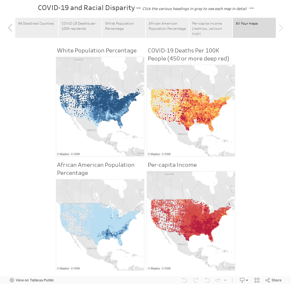
When we then color coded the various clusters on a United States county map, lighting up each cluster of similar counties with the same colors, we saw a pattern begin to emerge. The COVID-19 cluster map is nearly identical to the map that is clustered by the similar racial makeups of the counties. This was not the expected result, but this was what the data was showing us.
As we previously stated, correlation does not suggest causation, but in this case we were able to see a glaring overlap between the racial breakdown of each county using the percentages of the population that is White, African American, Latinx, Asian American, or Native American.
Using a Correlation Matrix, a grid that shows how strongly each feature is related to each other, we see that most features had either a neutral correlation, or less than a 10% correlation to the per-capita number of deaths or cases. However, at around a 50% correlation, the single strongest indicator correlating United States counties with high rates of death per-capita from COVID-19 is a high percentage of non-white residents. The next strongest is the percentage of African American residents, (the correlation is nearly the same and close to 50%).
While our leading indicator is race, there is also a noticeable correlation between counties that have lower levels of income and higher numbers of people testing positive for and dying from COVID-19. It should be noted that these are not cost-of-living comparisons, but pure dollar amounts. This could be indicating that areas where people are paid less (lower wages in general or lower-paying jobs in the area), or where unemployment is higher, are also areas with more cases and deaths per-capita. In other words the very fact of having a lower per-capita income in the county is an indicator that those people are more likely to die of this disease but it does not definitively show that having lower incomes predispose them to higher mortality rates.
The actual causes could be the availability of a good hospital, or environmental pollutants from manufacturing plants and factories. Maybe there is a lower tax revenue since there are lower incomes and likely lower housing values in those areas, and thus less money for public health administration or public hospitals. Still they could very well point to areas with more essential workers such as meat-packing workers, grocery and retail workers, healthcare workers and other people deemed essential yet paid low wages that cannot do their work from home.
What We Learned
To conclude, we were able to create a set of Machine Learning models that identify the leading indicators of a COVID-19 danger zone. Using Linear Regression models, Correlation Matrices, and Kmeans clustering algorithms, we can put large amounts of data to work in a quick process that can identify the largest indicators of danger zones.
Our current Covid-19 dashboard is updated daily, and shows each county, its per-capita death rate, total deaths from COVID-19, and a rough breakdown of its racial makeup alongside a map of the per-capita incomes for each county. The intent of this dashboard is to promote awareness and provide insights that can help public policy makers and officials can use to affect change, save lives, and keep people healthy during the COVID-19 pandemic and beyond.
This is just a start. The team at Cloud Brigade is soliciting input from the health care community, as well as civic and community leaders so that we may provide actionable insights related to this problem. We are continuing our work and building additional machine learning models and dashboards, including Time Series data and forecasting which will allow us to look at the past and into the future.
If you would like to follow our work, please signup for our newsletter.
You may also reach out to us using our Contact Form with any questions.
Project Team
“None of us is as smart as all of us.” –Ken Blanchard
Matt Paterson – Data Scientist
Quinn Wildman – Data Engineer
Chris Miller – Project Architect
Let me tell you a real story, that definitely happened.
With the announcement of Amazon Rekognition Custom Labels, we were trying to find a nice use-case to evaluate the performance of this new functionality. While we were thinking we got thirsty, so we ran to the fridge but instead of beverages, we found a surprise, the fridge was empty! “That does it!” said Chris, and he proposed a strange but very creative solution to our problem. “We are going to use Amazon DeepLens and Custom labels to track what products are missing from the fridge, we will never get thirsty again!”
In this post, we are going to see a use-case of Amazon Rekognition and Amazon DeepLens. We are going to use Custom labels to label some of the products in our fridge and then use DeepLens to capture images of our fridge. The ultimate goal here is to find out what products are lacking and what we need to buy. But first, let’s take a look at Custom Labels.
If you want to follow along you need to know a few things. Training your model costs 1$ per hour, and with 4-5 images per label the training time usually is about 1 hour
Deploying your model in order to be able to invoke it is the most expensive one. It costs 4$ per hour the model is running. So make sure you stop the model after you finish with Custom Labels
Amazon Custom Labels
“With Amazon Rekognition Custom Labels, you can identify the objects and scenes in images that are specific to your business needs. For example, you can find your logo in social media posts, identify your products on store shelves, classify machine parts in an assembly line, distinguish healthy and infected plants, or detect animated characters in videos.”
In this section, we see how to create a project, create a dataset, label images, and train a model.
Create a project
To create a project is very easy, just go to the Rekognition page and click on “Custom Labels” on the left sidebar and follow the steps:
Click on the “Get Started” button
Provide a name for your project
And click “Create Project”
In our case, we are going to create our rek-frigerator project in order to start recognizing products in my fridge.
Create a dataset
Now that we have a project, we need data to start training our model, and to provide our model with data we need to create a dataset. The steps here are equally as easy as the ones for the project creation.
Click on “Datasets” on the left sidebar
Click “Create Dataset”
Provide a name for your dataset
Select “Upload images from your computer”
There are several options here and you are free to explore them. For the simplicity of this use-case, we are going to use images from our computers
Click “Submit”
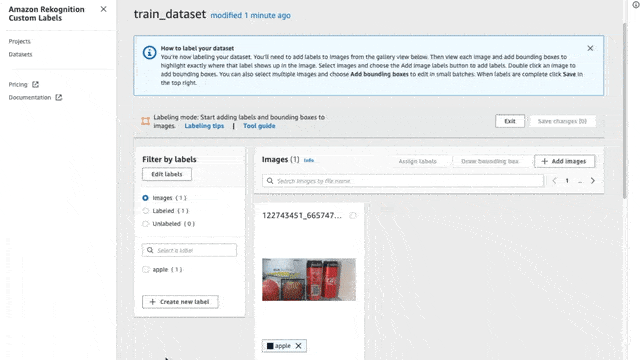
And voila! We have created a dataset, but wait… there are no images in this dataset! To add images simply click on the “Add Images” button and drag and drop any images you like to add.
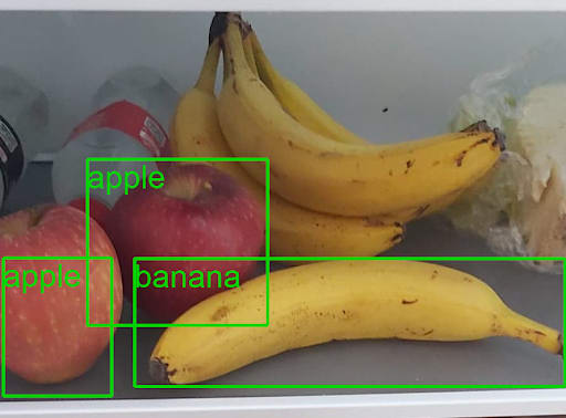
Make sure you add at least 4-5 images for each potential label (we will see in the next section what labels are). In our case, I downloaded some images showing the specific carton of milk I like, and I also took some pictures with my phone, summing up to a total of 12 images showing the milk carton. I added some extra pictures showing some fruits (apples and bananas) to add some extra labels to the model (again I gathered at least 8 pictures for each label).
There is a limit of 30 images at a time when uploading from your computer, so if you want to add more images then you will have to connect it to an S3 bucket and upload them there.
Create Labels
To start labeling our new dataset we first need to define what are the labels. There are two methods to do that: Create new labels Import them from a previous dataset
Since this is our first dataset we are going to create new ones.
Click on the “Add Labels” button (“Edit Labels” if you already have some)
Select the “Add Labels” radio button and start adding labels, that’s it!
Similarly, import labels from other projects
Here I created the labels that I would use:
Apple
Banana
Milk
Label images
Create a project, check. Create a dataset, check. Add labels, check. Now we need to start labeling our images for the model.
There are two methods to label your images
Label the whole image
Create MBRs (minimum boundary rectangles) on the individual objects on the image
To label an image, first, make sure that you are in Labeling mode. To do that simply press the “Start Labeling” button. Once you are set, click the “Assign Labels” button, select the images that you want to assign labels, and select the label for each image.
Draw rectangles
The same way goes for drawing the rectangles around your desired objects.
Select the images you want to assign labels
Click on the “Draw Bounding Box” button
Select the label from the right side section
Draw the box
Here on each image, I will try to create bounding boxes on objects inside my fridge (only bananas, apples, and milk cartons). I annotated 44 images with some of them having two or more labels in the same picture.
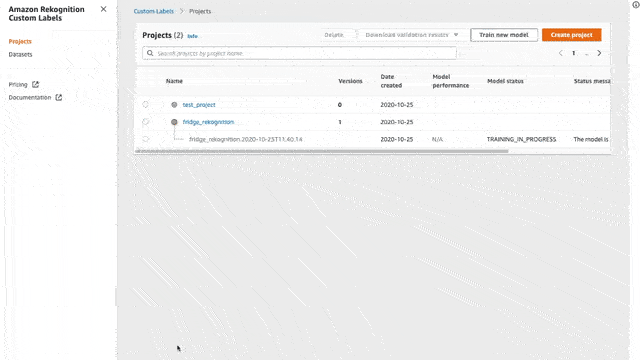
Train your Model
Now that we have all of our data labeled we will need to train our model in order to recognize our custom labels. To do that is again a few clicks.
Go to your project and click the button “Train Model”
Select the dataset that you have created in the previous steps with the labeled data
And for now, let’s select the “Split training dataset”
This will take your entire dataset and split it in 80/20, 80% for training, and 20% for testing. The training time depends on the number of images that you have in your dataset.
Using our trained model
And finally, we have a trained model!! Now it is time to use our trained model and start finding stuff! First, we need to start the trained model, and by start, I mean to deploy it in order to be able to send images. Make sure to stop the model once you are done since it is a bit expensive. To do that we need to run a command through the AWS CLI
The model ARN can be found when clicking the model, each model is actually a version of our project and that is why it is referred to as “project-version-arn”.
This will take some time… Once our model is started we can invoke it using the following aws cli command:
This will return a list of labels with their corresponding confidence. Yay!! We did it! Now let’s make it more readable and usable and create a python script that will answer all of our questions!
Source for this script and any other python scripts for Custom Labels can be found in the Rekognition Docs
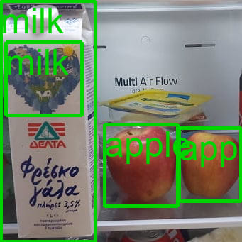
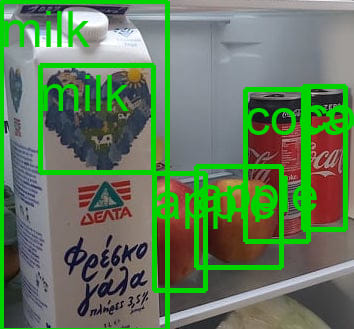
Review our results
Firstly, let’s see how we are doing with milk.
The model is trained correctly, but it seems we need close-ups on the images, and if there is too much noise the model cannot perform well. To fix this we need to add more images and more noise and retrain our model. In the following example, we can clearly see the problem.
It should be able to detect the bunch of bananas in the back but there is much noise in the front.
Cleaning up
Make sure you clean up your environment. The inference of the model is a bit pricy. To stop your model run the following command
If you want to delete your data and your project, go to your Projects delete the project by pressing the button “Delete”.
The Fridge Camera
We decided to use AWS DeepLens for this project for a few reasons :
It contained an IoT connected camera
It was already integrated with AWS services
It had a fisheye lens for wide view
Bonus: it could do inferencing at the edge
We needed some kind of a trigger to know when the fridge was open. The traditional way to do this would be with an electric switch, but the DeepLens does not provide digital IO pins. We figured we could use an image recognition model to detect an object in the fridge, using that as a trigger instead. It didn’t matter what it was, we just needed something.
At first we thought about using text detection to look for a specific string (OU812, a tribute to Van Halen), but setting up OCR or other methods was going to add too much complexity for the amount of time we had. So we decided to use the 20 object detection model included in the DeepLens model examples.
Next we had to figure out what object to use. We’ve previously had a lot of fun detecting animals, but it didn’t seem practical to put a dog in the fridge (JK, we wouldn’t do that). Although at one point we did try putting images of dogs and even bicycles in the fridge, but again that wasn’t practical as it took up valuable space we needed for beer.
After some testing, we noticed the sample model wasn’t very good at identifying objects in the fridge, and to be fair, it wasn’t designed for food. We noticed that cans of beer were detected as “bottle” so we went with that. Other things were also detected as bottle, but we didn’t care because it wasn’t like an astronaut was going to be harmed if the model was wrong.
There were physical challenges in mounting the camera close enough to see the fridge, but without bumping our head into the camera. Lighting was also slightly challenging. Fortunately we had a good Vlogging tripod available, and some spare cardboard for precise positioning.
DeepLens Strategy
You might be asking yourself, why are we using Rekognition Custom Labels to identify the food when we could do this right on the DeepLens. As an IoT device, DeepLens doesn’t have the same memory and CPU resources as cloud based services such as SageMaker endpoints or AWS Rekognition. It wouldn’t be able to work with a model of the necessary size, remain fast, and of course be accurate. Beyond that, while it’s possible, it’s much less practical to continually re-train models and deploy them to an IoT device.
The object detection models available for DeepLens simply allow you to see the object detection on the “project stream” a local video stream from the camera that includes bounding boxes and labels around the detected objects. In order to do more fancy things, you have to roll up your sleeves and add some code.
There are great examples on the AWS ML blog which allows you to stream video to AWS Kinesis Video Streams (KVS) right from the DeepLens. The DeepLens already has a KVS library and IAM service role which allow this. While that would work with Rekognition as well, the issue here is capturing the right frame at the right time when the fridge is open, but the thirsty engineer isn’t blocking the camera with their arm or head.
We figured that the moment the fridge was open, and during that hang time when the engineer is visually hunting for their kill, the view of the fridge was unobstructed and our “trigger” object would be detected. If we captured this one frame and sent it to Rekognition (via S3 of course), this would be the simplest solution.
Although DeepLens supports the boto3 library and we have access to built-in functions like boto3.client and session.get_credentials(), the GreenGrassGroup service role does not have access to S3 by default. Of course you don’t want to give full access to S3 here, because someone could do a lot of damage if they could access your entire S3 service from an IoT device. Be vigilant and lock things down to the minimum necessary permissions.
I want to pause here and mention that this was a collaborative project involving two AWS accounts. Because of this, we didn’t have direct access to each other’s internal account resources, so we had to set up an API Gateway in order to transfer images and to kick off a Lambda function which calls Rekognition. While this sounds like extra overhead (it was), it’s really just an exercise in what a production level IoT product deployment would look like.
API Gateway & Lambda
Setting up the API almost deserves it’s own article, and we will add this later time permitting. You only need to do this in a cross-account setup. The code samples for DeepLens include uploading to a local S3 bucket.
DeepLens Coding
Our code edits to the existing DeepLens object detection example are pretty straight forward and needed the following components :
Object Detected Conditional Routine
Image Frame Rotation and Capture
API Client
Local S3 upload (optional)
MQTT Publish Message (optional)
Near the top of our DeepLens Lambda function, we imported additional Python modules, and defined some simple API client functions using the powerful “requests” module. While you can do this in PyCurl, it’s actually a lot more lines of code and a bit more error prone, especially when doing a multi-part form POST with mixed data types (parameters and image data).
These functions will be called when the trigger object is detected. Be sure to instantiate your boto.client near the top of your GreenGrass Lambda (i.e. greengrass_infinite_infer_run) as well as start a session and get your credentials :
s3 = boto3.client('s3')
# Use the boto session API to grab credentials
session = Session()
creds = session.get_credentials()
The DeepLens examples usually just label any object that is detected and display it on the project stream. In our case, we want to do this only when a specific object is detected, as it just gets really noisy when trying to debug.
At the top of our while loop, we need to flip the image 180 degrees because the DeepLens camera is mounted upside down. We also need to grab a clean copy of the image frame without the bounding boxes printed as that would interfere with Rekognition.
while True:
    # Get a frame from the video stream
    ret, frame = awscam.getLastFrame()
    frame = cv2.flip(frame, 0)
    clean_frame = frame
    if not ret:
        raise Exception('Failed to get frame from the stream')
Next we just modify the for loop used for inference and reporting identified objects. We specify the bottle (5) from the output_map, and when present we apply a label to the image for the project stream, and set the flag “beer_present”. Beneath that we take care of naming and uploading our image to S3, then call Rekognition via the API Gateway and Lambda function.
# Dictionary to be filled with labels and probabilities for MQTT
cloud_output = {}
# Track whether or not at least one beer is preset
    beer_present = False
    # Get the detected objects and probabilities
    for obj in parsed_inference_results[model_type]:
        if obj['prob'] > detection_threshold:
            # Machine label 12 corresponds to a dog, if the label is present,
            # then at least one dog is in the frame
            if obj['label'] == 5:
                beer_present = True
                cloud_output['timestamp'] = time.strftime("%Y-%m-%d %H:%M:%S")
                cloud_output[output_map[obj['label']]] = obj['prob']
                client.publish(topic=iot_topic, payload=json.dumps(cloud_output))
                # Add bounding boxes to full resolution frame
                xmin = int(xscale * obj['xmin']) + int((obj['xmin'] - input_width/2) + input_width/2)
                ymin = int(yscale * obj['ymin'])
                xmax = int(xscale * obj['xmax']) + int((obj['xmax'] - input_width/2) + input_width/2)
                ymax = int(yscale * obj['ymax'])
                # See https://docs.opencv.org/3.4.1/d6/d6e/group__imgproc__draw.html
                # for more information about the cv2.rectangle method.
                # Method signature: image, point1, point2, color, and thickness.
                cv2.rectangle(frame, (xmin, ymin), (xmax, ymax), (255, 165, 20), 4)
                # Amount to offset the label/probability text above the bounding box.
                text_offset = 15
                # See https://docs.opencv.org/3.4.1/d6/d6e/group__imgproc__draw.html
                # for more information about the cv2.putText method.
                # Method signature: image, text, origin, font face, font scale, color,
                # and thickness
                cv2.putText(frame, "{}:    {:.2f}%".format(output_map[obj['label']],
                            obj['prob'] * 100),
                            (xmin, ymin-text_offset),
                            cv2.FONT_HERSHEY_SIMPLEX, 0.5, (255, 165, 20), 4)
    if beer_present:
        image_name = str(time.strftime("%Y_%m_%d_%H_%M")) + '.jpg'
        image_string = cv2.imencode('.jpg', clean_frame)[1].tostring()

        s3.put_object(Bucket="ou812-beer", Key = image_name, Body=image_string)
        image_path = '/tmp/' + image_name
        cv2.imwrite(image_path, frame)

        response = upload_file(image_path, image_name)

        cloud_output['upload_msg'] = ("Upload: {'successful' if response.status_code == 204 else 'failed'}")
        cloud_output['upload_response'] = (response.text)
        cloud_output['rekognize_status'] = (rekognize(image_name))

        client.publish(topic=iot_topic, payload=json.dumps(cloud_output))
        time.sleep(wait_time)
        beer_present = False
    # Set the next frame in the local display stream.
    local_display.set_frame_data(frame)
That’s it! Of course there’s always room for improvement and this is a great foundation to build upon.
About The Authors
Siaterlis Konstantinos is a Pythonista, AWS Community Builder, and passionate Data Scientist living in Greece. You can learn more about him on the website The Last Dev
Chris Miller is an entrepreneur, AWS Community Builder, and life long learner living in Santa Cruz, California. You can learn more about him on the website Cloud Brigade
What’s Next
If you like what you read here, the Cloud Brigade team offers expert Machine Learning as well as Big Data services to help your organization with its insights. We look forward to hearing from you.
Please reach out to us using our Contact Form with any questions.
If you would like to follow our work, please signup for our newsletter.
Cloud Brigade has been exploring Covid 19 data using Machine Learning algorithms, focusing on (or digging deeper) into data points that we feel were under-reported in the media. You can read more about our work in our blog, including this post.
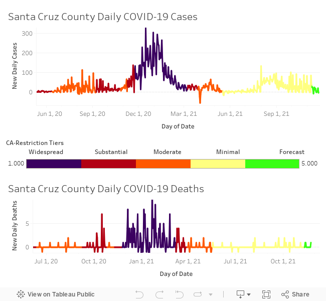
Covid-19 Infections and Deaths in Santa Cruz
In this dashboard we look at infection and death rates in our county, and color code this information based on the restriction tiers imposed. This serves to provide a time-series representation of the data, and to see how the restriction tiers may have impacted the spread of Covid-19 or the mortality rates.
var divElement = document.getElementById(‘viz1615820896832’); var vizElement = divElement.getElementsByTagName(‘object’)[0]; if ( divElement.offsetWidth > 800 ) { vizElement.style.minWidth=’420px’;vizElement.style.maxWidth=’650px’;vizElement.style.width=’100%’;vizElement.style.minHeight=’587px’;vizElement.style.maxHeight=’887px’;vizElement.style.height=(divElement.offsetWidth*0.75)+’px’;} else if ( divElement.offsetWidth > 500 ) { vizElement.style.minWidth=’420px’;vizElement.style.maxWidth=’650px’;vizElement.style.width=’100%’;vizElement.style.minHeight=’587px’;vizElement.style.maxHeight=’887px’;vizElement.style.height=(divElement.offsetWidth*0.75)+’px’;} else { vizElement.style.width=’100%’;vizElement.style.height=’727px’;} var scriptElement = document.createElement(‘script’); scriptElement.src = ‘https://public.tableau.com/javascripts/api/viz_v1.js’; vizElement.parentNode.insertBefore(scriptElement, vizElement);
Covid-19 Impact on Socio-economic and Race Groups
var divElement = document.getElementById(‘viz1605151530341’); var vizElement = divElement.getElementsByTagName(‘object’)[0]; vizElement.style.width=’1016px’;vizElement.style.height=’991px’; var scriptElement = document.createElement(‘script’); scriptElement.src = ‘https://public.tableau.com/javascripts/api/viz_v1.js’; vizElement.parentNode.insertBefore(scriptElement, vizElement);
Want to keep informed on this project?
Nothing Found
It seems we can’t find what you’re looking for. Perhaps searching can help.
We want to hear from you!
Interested in more information? Would like our help on a project? Have a question or idea we can help become a reality?