The Problem
COVID-19 is spreading and killing people unevenly through our national population, and public policy makers need a better way to narrow their focus to best handle this pandemic.
The Data Science Problem
Can we create and use a set of Machine Learning models and Data Science tools to identify the leading indicators of a COVID-19 danger zone or hot-spot and help our community protect itself against this deadly disease?
The Resolution
Using Linear Regression models, correlation matrices, and Kmeans clustering algorithms we can put large amounts of data into a quick process that can identify the largest indicators of danger zones.
The Benefits
Our dashboard can identify areas where COVID-19 is hitting hardest and highlight reasons why that might be to help policy makers respond to this pandemic and prevent the proliferation of subsequent health crises.
The Use Case
Policy makers can use this dashboard to create preventative policies such as masking requirements, social distancing requirements, closures of bars/indoor dining, or the limiting of public gatherings; can identify industries such as farming or meat-packing that have higher incidence of transmission and more dangerous comorbidities in the population.
Our Future Steps
Using DeepAR in a Recurrent Neural Network, we can create a time series prediction engine that can help us plan and react on the fly to changes in the spread of the virus.
Origin Story
About a month after the stay-at-home orders were issued in the Bay Area, we began to notice a disparity in what was being reported in the news about COVID-19. Every day we were seeing dashboards with data graphs around infection rates and death rates, but we also heard stories reported that weren’t being reflected in that data.
We’re talking about everything from socio-economic and behavioral data, to unproven claims about climate and sunlight killing the virus. We thought that if we could acquire this data, we could learn some interesting things about COVID-19 using Machine Learning. By identifying the leading indicators present in the hot spots, we might better understand what was contributing to these outbreaks, and debunk some myths along the way.
The first thing that we had to do was to identify what information to collect and from what sources to get our data. We talked about some of the obvious, such as how many daily cases and deaths were happening, and found that Johns Hopkins University had an open-source data repository.
We reviewed a list of potential types of data we might consider, and it was important that the data be similar in granularity, preferably down to the county level. The list included :
- Climate data (temp, humidity, precipitation, and cloud cover)
- Population density by race
- Wealth distribution
- Urban/rural distribution
- Travel volumes
- Deaths by cause
- Political leanings
- Religion leaning
- Education levels
Responsible Reporting
It’s important to acknowledge the data in this list contains a potpourri of hot button topics, we knew that going in. The purpose of this project was not to support (or oppose) any particular point of view, in fact it was quite the contrary – to explore and uncover the hidden truths within the data.
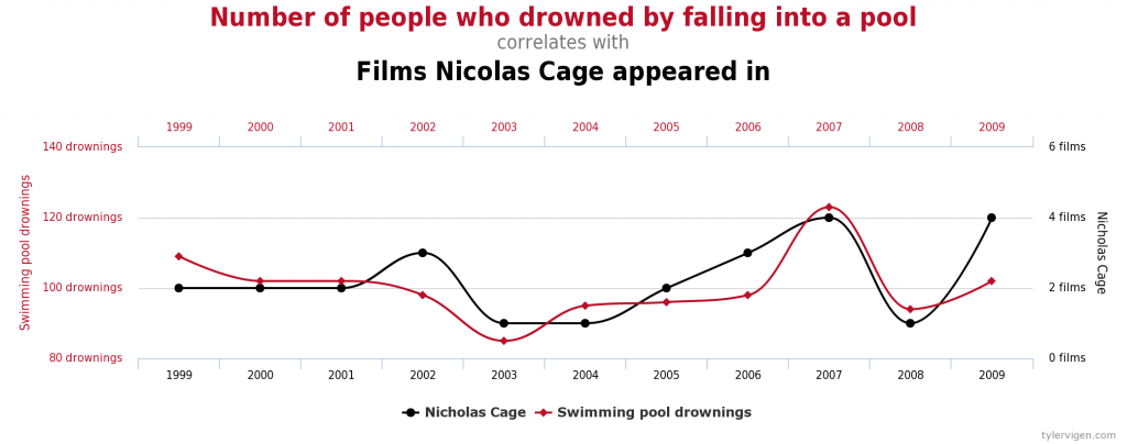
Of equal importance, one must embrace that correlation does not imply causation. For those of you who aren’t statisticians, this means that although we will find relationships in the data, those alone to not provide the underlying cause. They will however warrant further exploration and discussion.
Minimally Viable Product
Our list was large, but we needed to start small and to validate our findings at each phase, so we chose a subset of the original data to start.
We looked for different sources of weather data, population data, per-capita and household incomes, total jobs in each county, SNAP benefits and Medicare benefits information, and even percentages of rentals in a county receiving Low Income Housing Tax Credits. For these we found data from the US Bureau of Economic Analysis and the Census Bureau, and from Wikipedia and the USDA.
We further considered data that could show us different types of commuting methods in use such as buses, trains, or cars in an area; the general commercial makeup of a county (what kinds of industries are there), what the land percentages were for urban versus rural areas, and education levels of the population, but we found that the data sources available had too many missing values, or holes in the data set, so we deferred this for later consideration.
Other pieces of information such as the political leanings of a county, the religiosity, the presence or absence of a college or university, or even the breakdown of age and gender were all readily available, but the time it takes to break them down for use in a model was beyond the scope of our phase one plan.
Preparing the Data
The largest time consumer in any Machine Learning project is the collation and standardization of the data, or exploratory data analysis as we call it. Most data sources contain missing data or data that is in different units (think miles versus meters, or pounds versus tons), so when trying to decide on which data to use and which to leave for the next iteration, completeness had a lot to do with the decision making process.
For example, it would have been great to use hospitalization data on the first run through, to compare, for example, what the percentage of available hospital beds in the Bronx looked like compared to that of Hancock County, Georgia, or McKinley County, New Mexico. Unfortunately, the hospital data that was available both in April and in September was too sparse and too challenging to impute, a data science term for intelligently filling the holes in the data.
Machine Learning
So, after analyzing the data that we had, the next thing to do was to put the data into a Linear Regression model. This model tries to put your data into a line on a graph and compute an equation of a line that best fits the plotting of the points. This is known as a Supervised Learning model because we are teaching the model to predict values using values that are already known, or the Ground Truth.
We found that our model predicted the number of deaths and total cases accurately, and much like the early media stories, it pointed to large population centers as the danger spots for the virus. But as we know now, that was not really an accurate look at what was going on. This became more apparent when we began the feature engineering portion.
Feature engineering is the creation of new features in the data using information already attained. In this case we created features showing the number of cases per one hundred thousand residents and the number of deaths per hundred thousand residents. With a more apples-to-apples look at every area, the features started to really demonstrate their relationships.
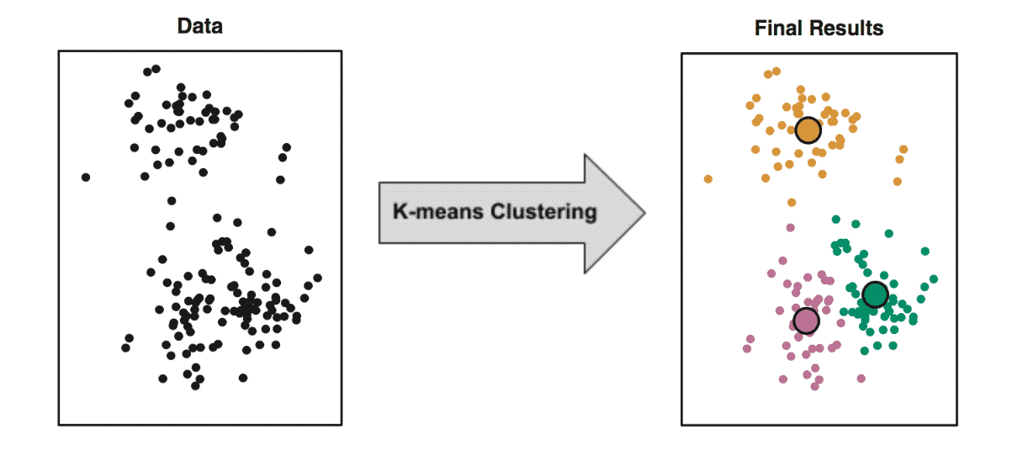
Next, we used the Kmeans algorithm which creates clusters of counties that have similar characteristics. Kmeans is an Unsupervised Learning model that essentially plays “one of these things is not like the other” with your data. It will cluster your data points into as many clusters as you’d like based on which data points are most similar. This is the same process that banks use to identify fraud in the middle of millions of financial transactions by seeing similarities that humans would not perceive.
The Results
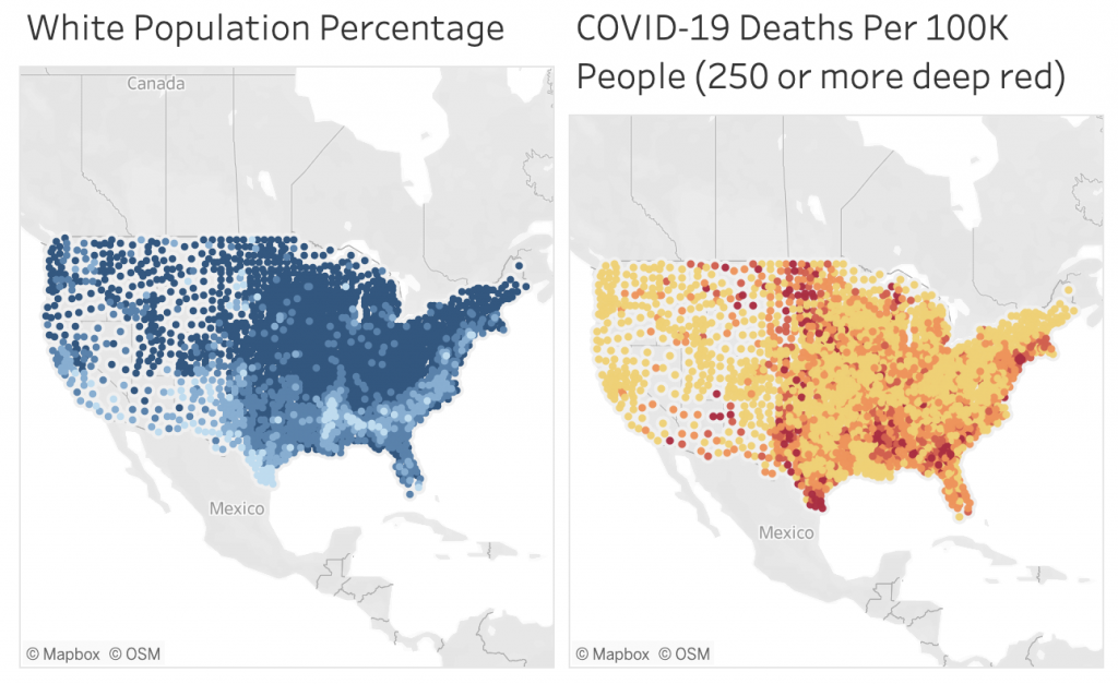
When we then color coded the various clusters on a United States county map, lighting up each cluster of similar counties with the same colors, we saw a pattern begin to emerge. The COVID-19 cluster map is nearly identical to the map that is clustered by the similar racial makeups of the counties. This was not the expected result, but this was what the data was showing us.
As we previously stated, correlation does not suggest causation, but in this case we were able to see a glaring overlap between the racial breakdown of each county using the percentages of the population that is White, African American, Latinx, Asian American, or Native American.
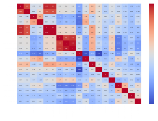
Using a Correlation Matrix, a grid that shows how strongly each feature is related to each other, we see that most features had either a neutral correlation, or less than a 10% correlation to the per-capita number of deaths or cases. However, at around a 50% correlation, the single strongest indicator correlating United States counties with high rates of death per-capita from COVID-19 is a high percentage of non-white residents. The next strongest is the percentage of African American residents, (the correlation is nearly the same and close to 50%).
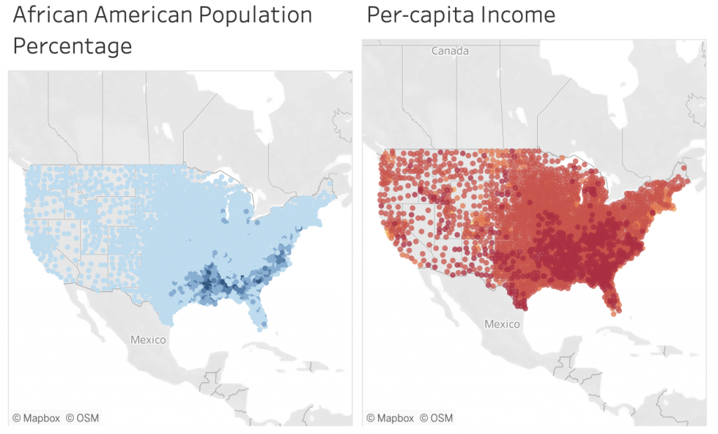
While our leading indicator is race, there is also a noticeable correlation between counties that have lower levels of income and higher numbers of people testing positive for and dying from COVID-19. It should be noted that these are not cost-of-living comparisons, but pure dollar amounts. This could be indicating that areas where people are paid less (lower wages in general or lower-paying jobs in the area), or where unemployment is higher, are also areas with more cases and deaths per-capita. In other words the very fact of having a lower per-capita income in the county is an indicator that those people are more likely to die of this disease but it does not definitively show that having lower incomes predispose them to higher mortality rates.
The actual causes could be the availability of a good hospital, or environmental pollutants from manufacturing plants and factories. Maybe there is a lower tax revenue since there are lower incomes and likely lower housing values in those areas, and thus less money for public health administration or public hospitals. Still they could very well point to areas with more essential workers such as meat-packing workers, grocery and retail workers, healthcare workers and other people deemed essential yet paid low wages that cannot do their work from home.
What We Learned
To conclude, we were able to create a set of Machine Learning models that identify the leading indicators of a COVID-19 danger zone. Using Linear Regression models, Correlation Matrices, and Kmeans clustering algorithms, we can put large amounts of data to work in a quick process that can identify the largest indicators of danger zones.
Our current Covid-19 dashboard is updated daily, and shows each county, its per-capita death rate, total deaths from COVID-19, and a rough breakdown of its racial makeup alongside a map of the per-capita incomes for each county. The intent of this dashboard is to promote awareness and provide insights that can help public policy makers and officials can use to affect change, save lives, and keep people healthy during the COVID-19 pandemic and beyond.
What’s Next
This is just a start. The team at Cloud Brigade is soliciting input from the health care community, as well as civic and community leaders so that we may provide actionable insights related to this problem. We are continuing our work and building additional machine learning models and dashboards, including Time Series data and forecasting which will allow us to look at the past and into the future.
If you would like to follow our work, please signup for our newsletter.
You may also reach out to us using our Contact Form with any questions.
Project Team
“None of us is as smart as all of us.” –Ken Blanchard
Matt Paterson – Data Scientist
Quinn Wildman – Data Engineer
Chris Miller – Project Architect
